Talk What Medical Device Software to Develop Under QMS: Webinar Summary medical device software development, product development
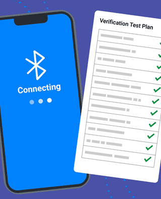
Article Testing Strategies for Bluetooth Medical Devices bluetooth, medical devices, risk management, verification & validation
Article Patient Engagement & UX for Bluetooth Medical Devices bluetooth, Human Factors & UX, medical devices, patient engagement, Product Design
Article How Design Can Improve Ratings for Medical Device Apps Human Factors & UX, mobile medical apps, Product Design
Talk Preparing Your MedTech Startup for Acquisition: Webinar medtech acquisition, medtech entrepreneurs